VI. How To?
6.4. Page Design
6.4.1. Colours
The use of colours in any graphical material is very important. Indeed, it is said that colours can transmit feelings and have different meanings; designer will generally choose the colours to be used in a particular design on different criterions: the traditional colours of the company, of its logo, the view of the company...
But the most important, when using colours on the web, is always to remind that firstly some very old screens may not be able to print all four billion and more colours available for most recent screens. Generally, the only impact for older screen will be a lesser quality of pictures, and should not be an accessibility problem. However, if colours are not chosen properly, they can represent an accessibility barrier to disabled user, in particular colour-blind, people suffering from dyslexia or hyper sensitivity to light, and even in some measure blind people or LCD (Liquid Crystal Display) screen that will have a different render of colour depending on their inclination; but poor colours choice can also be a problem for people who have a good vision.
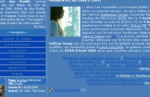
As seen in Chapter 4.1.1. Visual Disability, no information should be conveyed by colour mean only, as colours can be confounded or simple not visible; it is also important that texts and background benefit from an sufficient contrast in order to colour blind people to be able to distinguish them, but also, sometime, just for “normal” people to read it. This problem is shown on the figure 6.3; indeed, if the general content of the website, in white, present a good contrast ration with the middle blue background, the links, in a slightly darker blue, do not. There are rather difficult and tiring to read, and may become unreadable on a badly calibrated screen.

Figure 6.3: Screenshot of a website (http://secret.kamiki.free.fr/) presenting blue links on blue background.
On the other hand, it is also important to note, that a maximal contrast ratio, especially on a dark background, will also be difficult and tiring to read, especially for people suffering from dyslexia or hyper sensitivity to light. The use of a slightly lower contrast ratio will be more comfortable for all to read.
Figure 6.4: Example of different contrast ratios between background and texts.
On the example above: the text on the left is pure white (hexadecimal code: #ffffff), with a contrast ration with the background of 255, while the text on right is a light grey (hexadecimal code: #dddddd) with a contrast ration of 221. It is a very slight difference, but it does make the text easier to read, for all readers. The W3C suggested the following formula to calculate the contrast ratio:
((Red value X 299) + (Green value X 587) + (Blue value X 114)) / 1000
The W3C advices that the calculated value should be greater than 125, however they do not give any upper limit...
Online tools can be used to easily calculate or check the contrast between two colours:
- Juicy Studio’s Colour Contrast Analyser: http://juicystudio.com/services/colourcontrast.php#specify
- Colour Vision: http://www.iamcal.com/toys/colors/
- Colour Scheme Generator: http://wellstyled.com/tools/colorscheme2/index-en.html