VII. A Few Questions
7.4. Too Much Accessibility Kills the Accessibility
Roger Johansson wrote that “Sometimes when people first learn about Web accessibility they look for quick ways of improving the sites they build. This often leads to misuse or overuse of certain HTML features that are meant to aid accessibility, but when used wrongly have no effect and can actually have the opposite effect by making the page less accessible and less usable” (Johansson, 2007). Indeed, without a good understanding of the Web Accessibility concept, of the difficulties encountered by users on the Internet, and of the techniques that can be used to overcome these difficulties, it is difficult to use these techniques in the way they are intended to improve a website’s accessibility.
Mike Davies notes that such misunderstandings in the use of “accessibility techniques” are generally dues to distorted advices (for example: “the alt attribute of an image should always be specified”) and comments that “When you give a developer a distorted piece of advice, the end result of following such advice is correspondingly distorted. A developer needs to understand why the change he is making is necessary (what barrier does it tackle?), how it benefits people with disabilities (who is affected by the barrier), and what are the side effects of doing it (what other barriers does it leave or create?). When the accessibility problem is identified and understood, the path to an actual solution is relatively straightforward” (Davis, 2007).
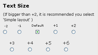
One of the most common well meant accessible distortions is certainly the use of widgets to bring functionalities that already exist within the web browser. It is the case of the text size widget that can be found on many websites.


Figure 7.4: Examples of Text Size Widget (http://whatdoiknow.org/ and http://www.bbc.co.uk/displayoptions/customise.shtml).
If such widgets may look like an accessibility improvement, they are generally useless. On the first example above, the difference between the three offered sizes for texts: 100%, 110%, and 124%, is so little that it may be helpful to rest the eyes of someone with a good sight, but it will definitely not be enough for someone who is short sighted – in my own experience as a glasses wearer, I know that when I took my glasses off (-4.00 dioptres) I need a font size of at least 200% to be able to read a text comfortably.
The best solution is to teach the users how to use their web browser and the functionalities coming with them.