VII. A Few Questions
7.3. Accessibility and Advertisement
In a survey, held in 2004 by the Nielsen Norman Group, were gathered the most hated advertising techniques on the web. The most cited hates techniques were: pops-up in front of your window (95%), loads slowly (94%), tries to trick you into clicking it (94%), does not have a close button (93%), covers what you are trying to see (93%), doesn’t say what it is for (92%), moves content around (92%), occupies most of the page (90%), blinks on and off (87%), floats across the screen (79%), and automatically plays sound (79%) (Nielsen, 2004). One of the reasons these techniques are so despised may be because they prevent or slow the user to access the information he really wants; indeed, the implementation of these techniques make a website inaccessible.
The most problematic, on an accessible point of view, techniques are certainly the ones that:
- Tries to trick the user into clicking it: generally by mimicking a system window and presenting a closing symbol (a cross generally) making the user believe that by clicking it the ad will disappear or by masking the content with no other choice than to click on it to make it go away to access the information. The example presented on the figure below uses this technique: clicking on the cross in the attempt to close the banner window will activate a link to a dating website.
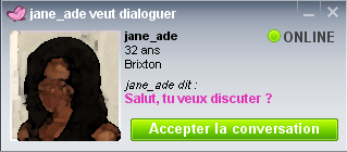
Figure 7.3: Example of lurking banner..
The use of this king of technique may be good from the advertisement perspective, indeed the more users lurked the more visitors; but, from the accessibility perspective, the user will be confronted to a behaviour they were not expecting and may be strongly disturbed. - (Hover) Pops-up: pops-up are unwanted appearing windows, they have been, and certainly still are, the most used advertisement technique on the Internet. There utilisation is disturbing on an accessibility point of view because they can disturb the user while browsing a website, especially beginners. Nowadays, however, most recent web browsers implement a pop-up blocking function. To which publicist answer with a new technology: the hover pop-up. This pop-up does not open a new windows, it appears on the actual page, generally hovering its content, making it impossible to read without closing it. Some publicist go so far as to remove any closing possibility to the pop-up; the user thus have to either click on the banner (see above) or wait for it to finish playing, thus taking away from him the choice to view the banner or not.
As seen in section 5.1.2. Users are Blind to Advertisement, Nielsen highlighted, with his eyetracking researches, that users have gotten so used to advertising banners that he seems to have developed some kind of banner protection (Nielsen, 2007a). Which publicists are well aware of. And here is a new accessibility problem, because if advertisement is annoying to most users, it remains necessary; and its purpose remains to earn money, which can only be achieved if the banners are seen. Publicists have thus developed new techniques for online advertisement, those techniques mostly being based on the idea that, if user avoid everything that looks like an ad, then the ad should look like the content. The accessibility problem here is that it becomes difficult for the user to identify what is the content and what is the advertisement.
Jakob Nielsen warns that “this overtly violates publishing's principle of separating "church and state" -- that is, the distinction between editorial content and paid advertisements should always be clear. Reputable newspapers don't allow advertisers to mimic their branded typefaces or other layout elements. But, to maximize fixations, that's exactly what you should do in a Web ad” (Nielsen, 2007a).
Advertisement on website, that is be in the middle of the content or on a clearly distinct area of the page, should always be identified as such. Moreover, advertisement, as any other content, should answer the accessibility principles such as providing alternative content to audio, video and sound content.