V. Accessible Content
5.1. How do User Read on the Internet
5.1.2. Users are Blind to Advertisement
Several eye tracking studies such as the one realized by the Nielsen Normal Group or the Usability Company showed that users tend to not see advertisement banners (Nielsen, 2007a; The Usability Company, 2003).
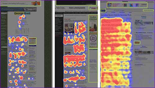
Figure 5.2: Heat maps from eyetracking studies: Advertisement.
Note: The areas where users looked the most are coloured red; the yellow areas indicate fewer views, followed by the least-viewed blue areas. Gray areas didn’t attract any fixations. Green boxes were drawn on top of the images (Nielsen, 2007a).
Furthermore, “Users almost never look at anything that looks like an advertisement, whether or not it’s actually an ad” (Nielsen, 2007a). Indeed, Nielsen demonstrate that the use of “fancy formatting or fancy words” like it is often done in banners, made the fancied content interpreted as advertisement, and thus was generally ignored. Nielsen used the example of the U.S. Census Bureau’s homepage, where the tester were ask to find the actual population of the United States, which is written in red big letters on the top left of the screen (see figure 5.3); 86% of the user were unable to answer the questions because this part of the page had been interpreted as advertisement (Nielsen, 2007b).
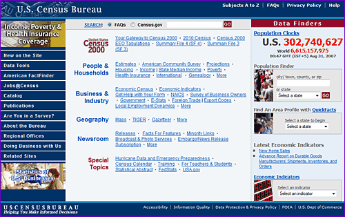
Figure 5.3: Homepage for www.census.gov, as tested (Nielsen, 2007b).
The Usability Company explains that “people learned very quickly where advertisements were likely to appear on a site and subsequently ignored those areas of the page when browsing. For example, while people viewed the adverts on the right hand side of the Guardian home page they rarely, if ever, looked to the right hand side of subsequent pages on the Guardian site – they had ‘learned’ that this area was reserved for advertising and therefore not of interest to them. Likewise having seen the banner ad at the top of The Times homepage very few people looked at the banner ad on other pages of the site.” (The Usability Company, 2003).